Kalemi
Giving the company behind the products a presence of its own.
- Industry
- Social media software
- Growth stage
- Mature
Business
Kalemi had built Publer into an established social media management platform. With Linkie and Kibo joining its portfolio, the company’s work covered more of how people show up online, from sharing content to managing conversations. Each product had its own purpose. Together, they represented a company with more to introduce.
Challenge
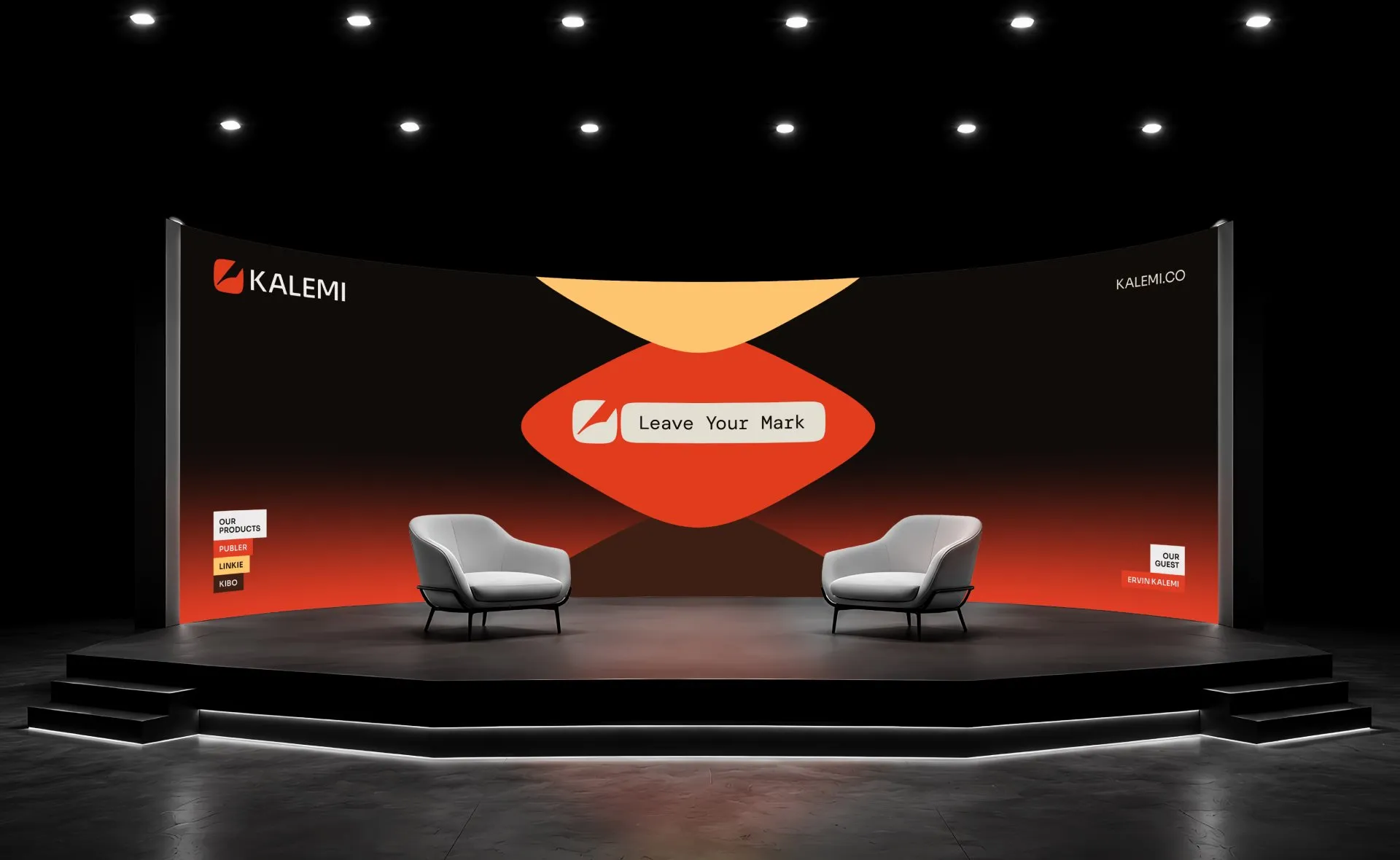
Preparing for Web Summit brought that need into focus. The team saw it as the right moment to create a parent brand for everything they were building. They came to us for a visual identity that would give Kalemi a presence of its own.
Observation
To build that identity, we first needed to understand Kalemi’s role in relation to its products. How should the company appear alongside them? Where should each product lead? And how could that relationship accommodate what Kalemi might build next? We began with brand architecture to establish the structure behind those decisions.
The products were at different stages. Publer already had recognition and trust in its market, giving Kalemi a strong example of what the company could build. Linkie and Kibo could benefit from a clearer connection to the company behind them. The architecture needed to respect those differences while making their shared origin visible.

Architecture
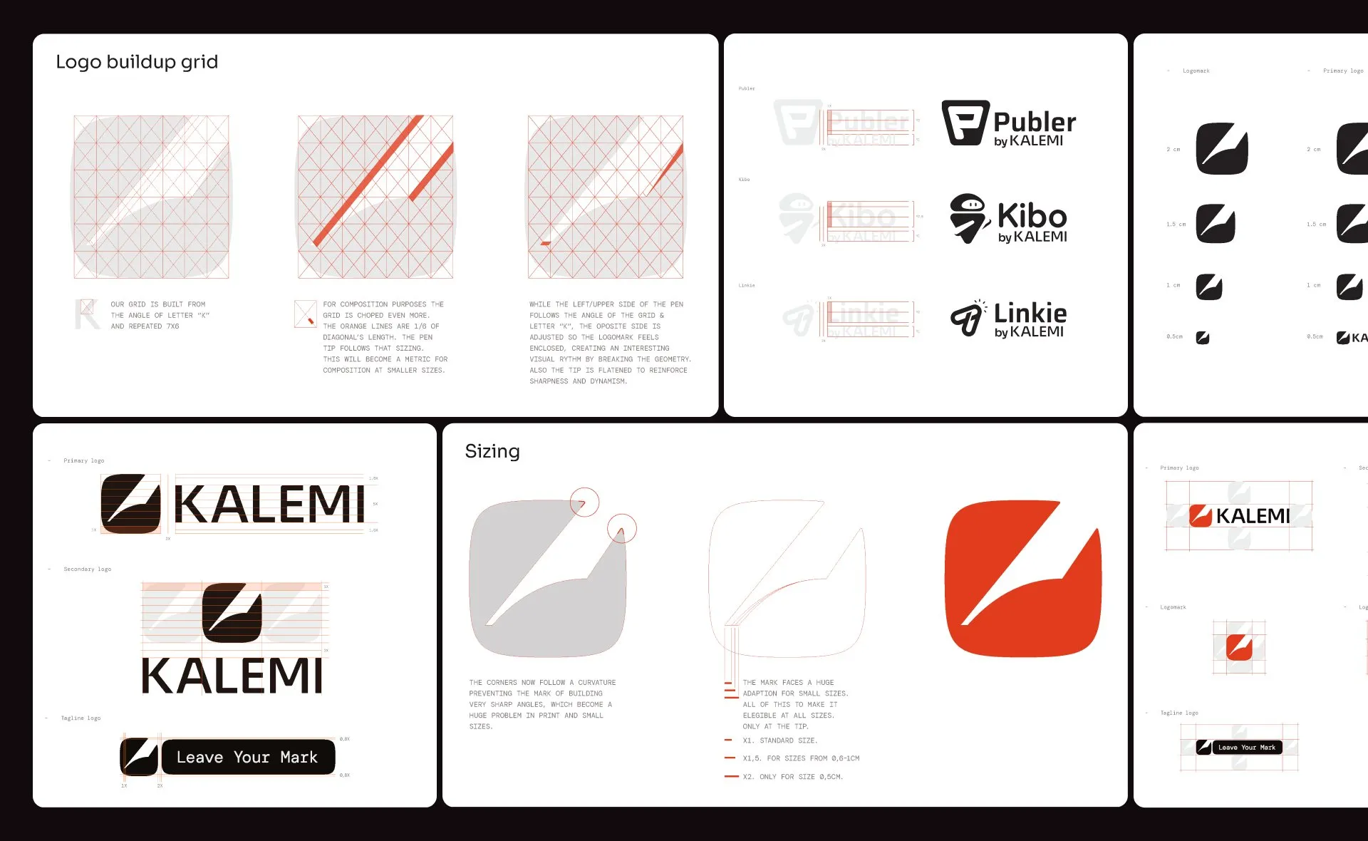
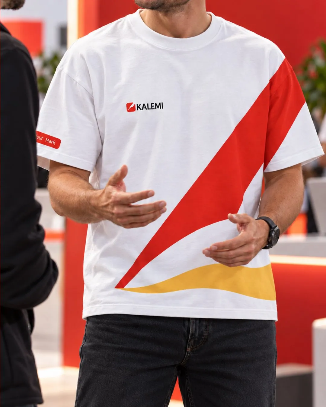
We established an endorsed model. Publer, Linkie, and Kibo would continue to lead with their own names and identities, supported by “by Kalemi.” We defined where that connection should appear, including company pages, event materials, and product website footers. This gave Kalemi a consistent way to stand behind its products while allowing each one to develop its own reputation. It also created a structure that could extend as the portfolio grew.

Identity
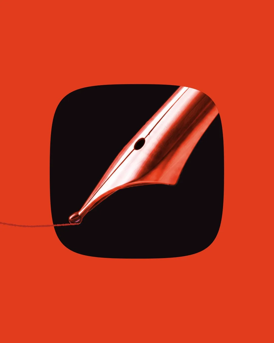
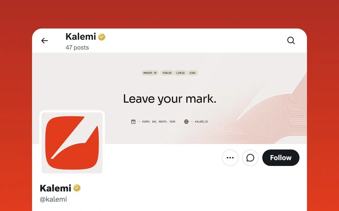
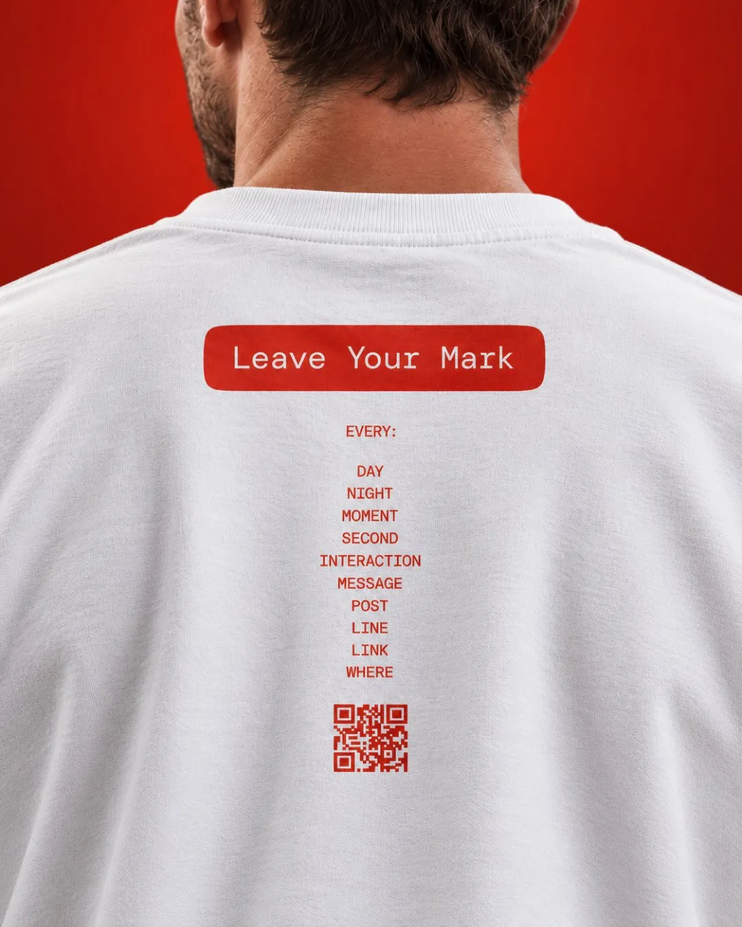
With that role defined, we moved into the visual identity. Kalemi’s connection to the pen gave the work a starting point: a simple instrument through which an idea takes form and leaves a mark. It offered a meaningful symbol for a company building tools that help others express themselves and connect online.
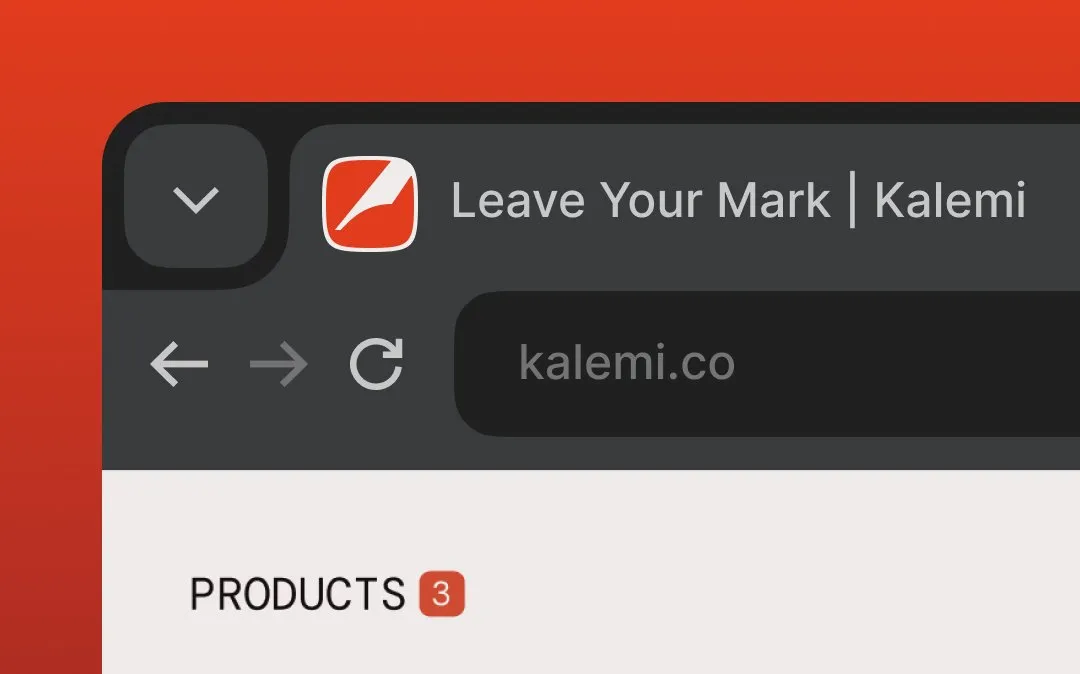
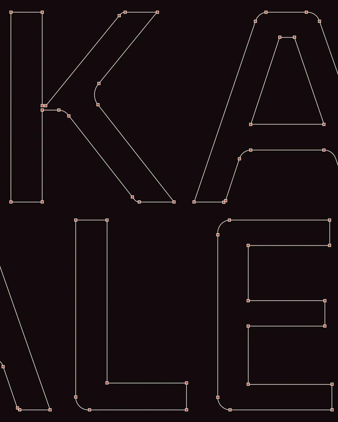
We explored and refined the mark around that idea. Its construction drew on the angles of the letter K, with the pen form adjusted to suggest the act of writing. Further refinements addressed the shape, balance, and clarity of the symbol at small sizes. The result gave Kalemi a distinct mark that could work across the places the architecture had defined.
Website
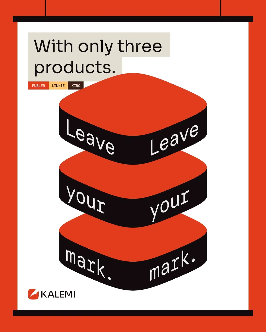
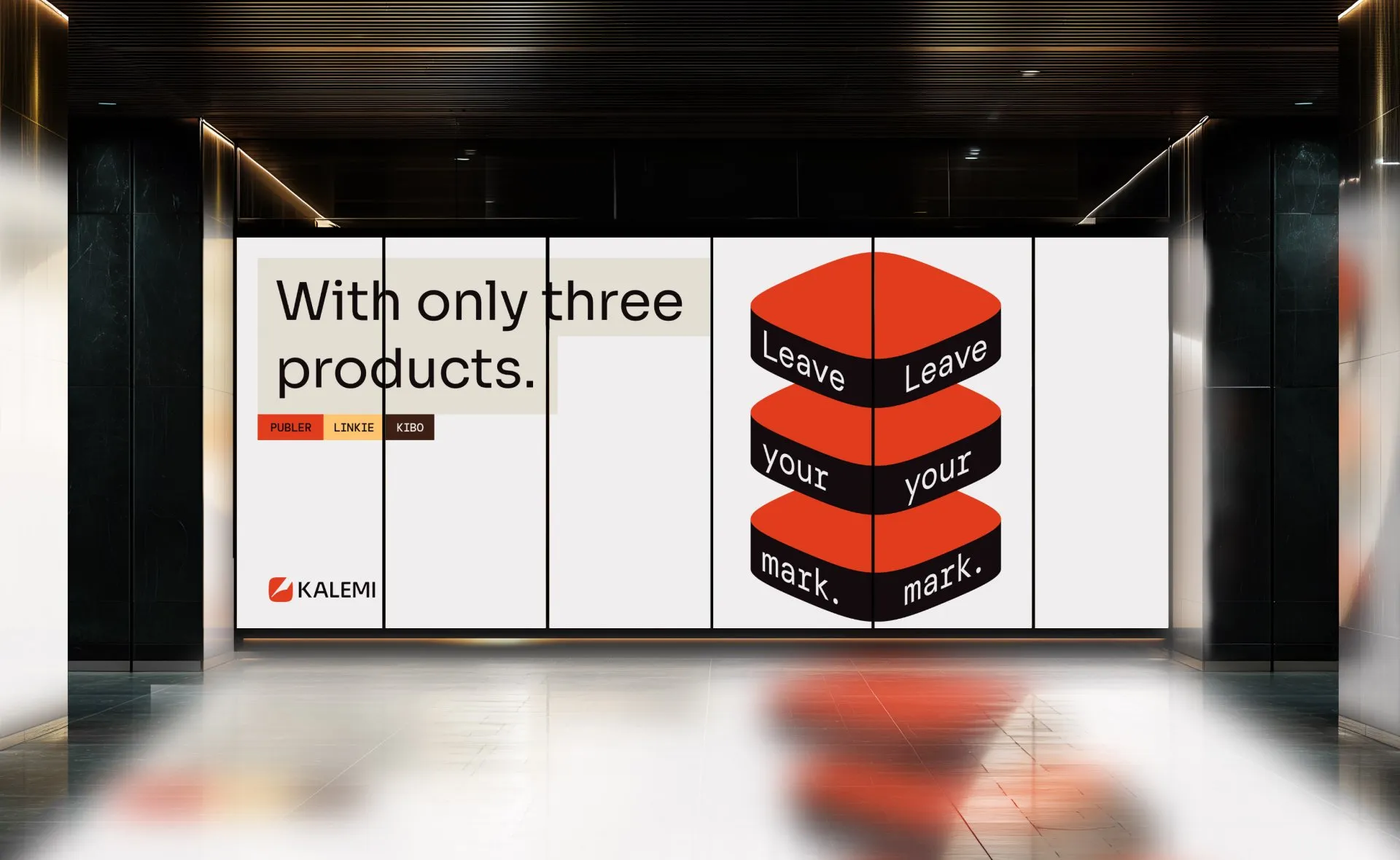
The pen also gave us a thread for the company’s message: “Leave your mark.”
We carried that thread into Kalemi’s website, handling the structure, copy, design, and development. The page introduced the company, explained the role of each product, and connected them through a shared purpose. Its story brought the years of building behind Kalemi into view, giving visitors a way to understand both the products and the company responsible for them.
Change
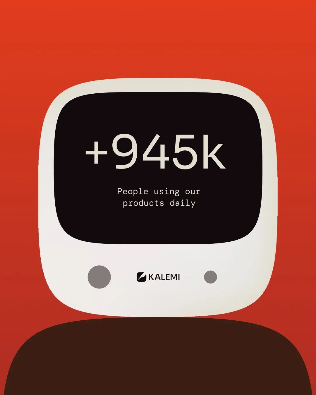
Kalemi now has a defined relationship with its portfolio, an identity of its own, and a website that brings the company’s work together. The team has a clear way to introduce Kalemi, supported by the products it has already built. As new products take shape, there is a structure for giving them a place within the same company story.

Our collaboration influenced the following results

Ervin Kalemi
Founder & CEO @Kalemi
“STUDIOZ’s ability to bring out the vision we didn’t know we had was impressive. Thanks to their work, we now have a brand identity and positioning. Everyone has praised our new logo and website, and we’ve seen more traffic and social media engagement. They delivered in record time, and I’ve decided to continue working with them because they’ve helped me figure out my long-term vision for Linkie.”

Read similar case studies
Sojourn Serai
An identity for a longer kind of journey.
Sphere
An identity built to move with threat intelligence.

Vetch Studio
A studio rooted in the work it serves.