Alphatechs
A stronger presence for a cybersecurity company ready to grow.
- Industry
- Cybersecurity
- Growth stage
- Growth stage

Challenge
After its first year, Alphatechs was preparing to reach new markets. The company needed a brand and website that could communicate its expertise and give prospective clients a clearer understanding of its services.
The existing identity offered little recognition to build on. Working closely with the founders, we developed a new direction that could support where they wanted to take the business.


Solution
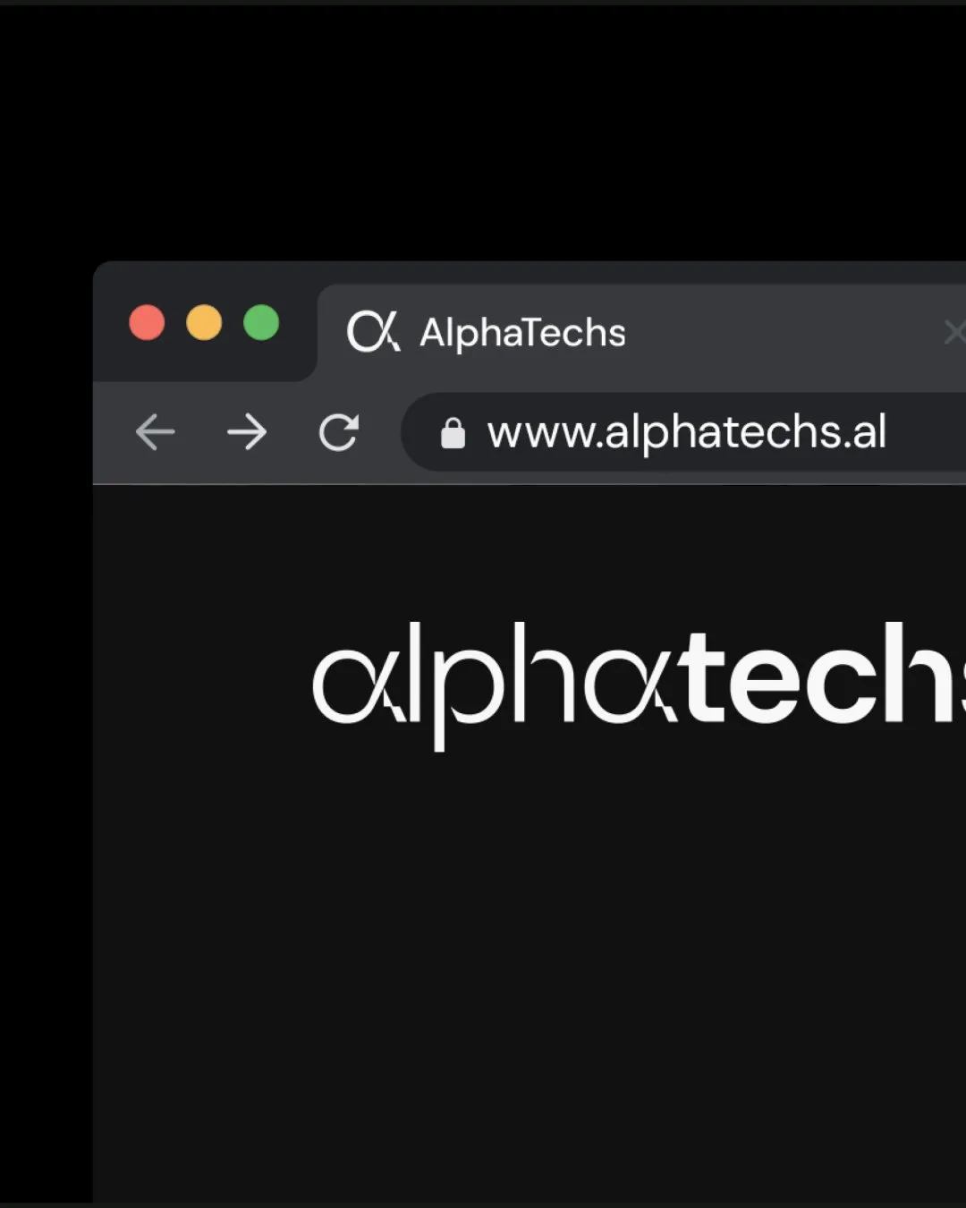
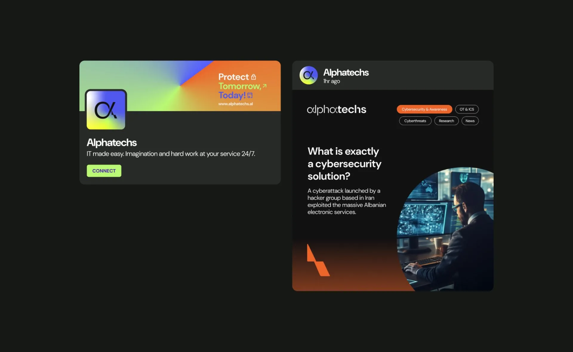
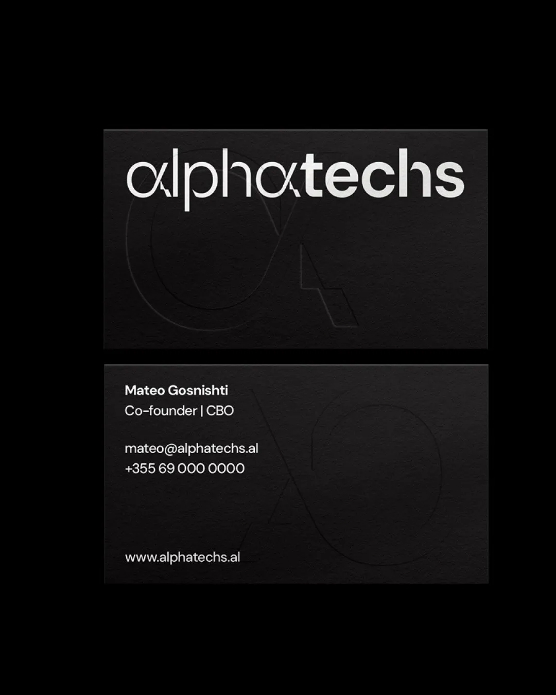
We built the wordmark around the alpha symbol, introducing glitch details that reflected the changing nature of digital threats. This gave Alphatechs a distinct visual idea connected to the environment it works in.
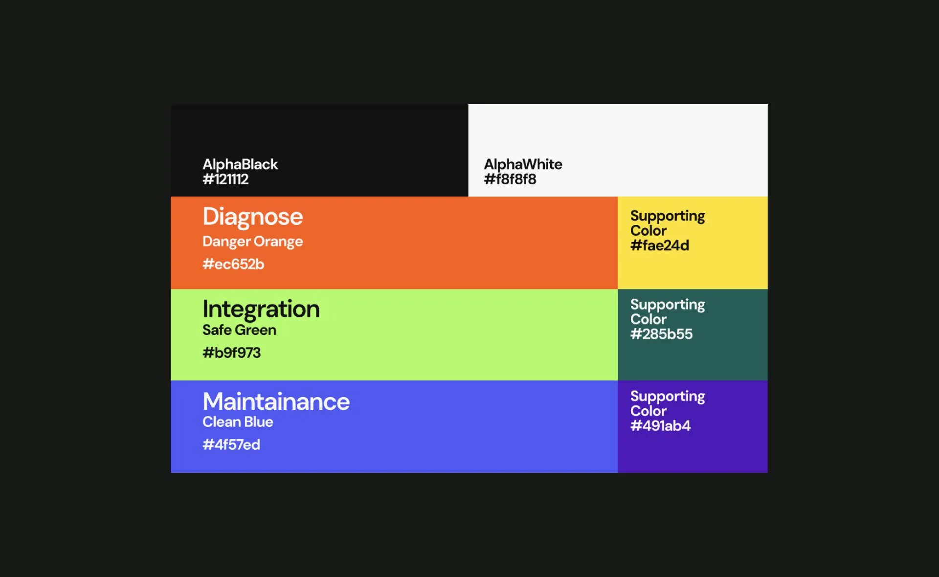
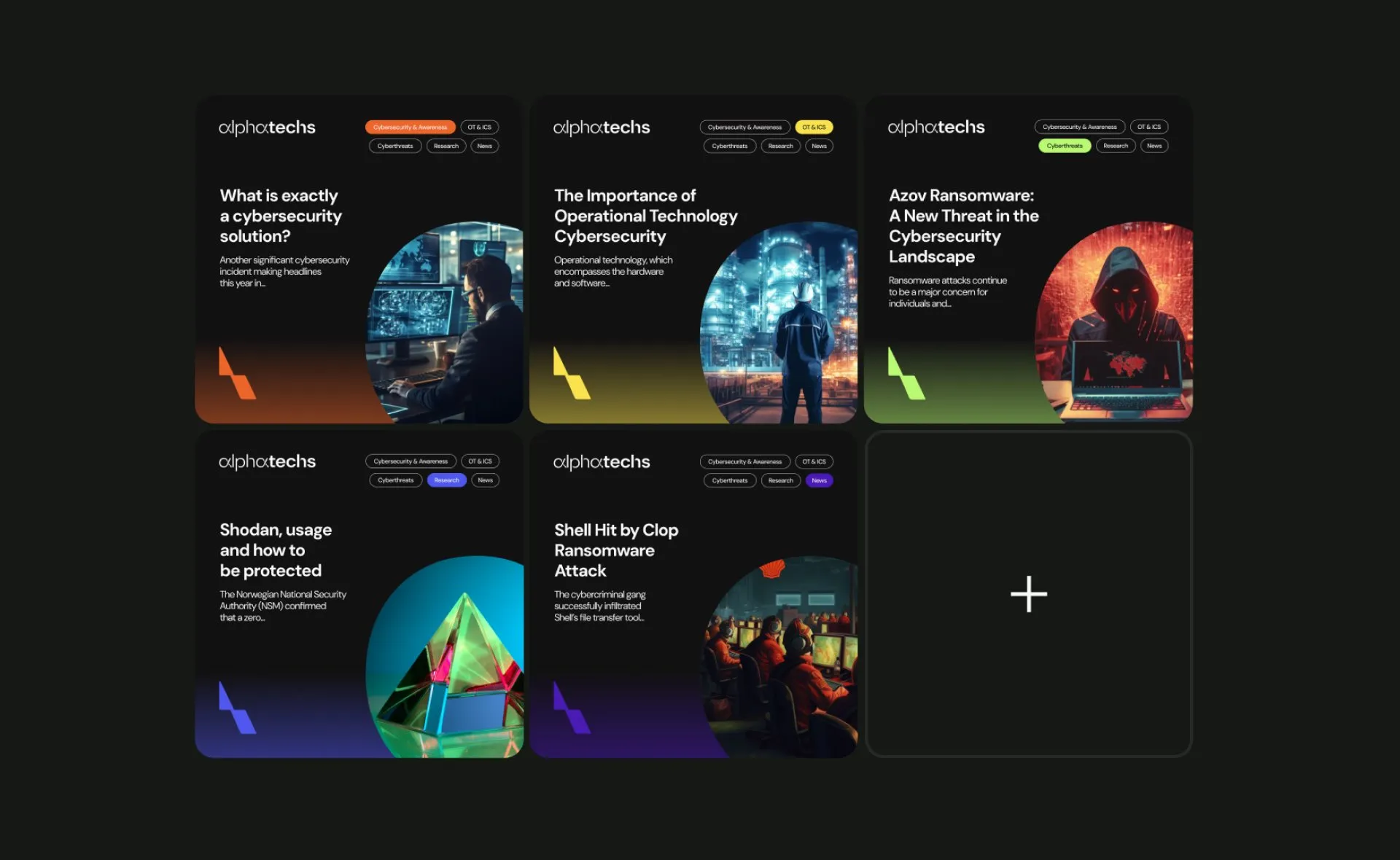
The system also helped organise its offering. Orange identified Cyber Check, green represented Integration, and blue signalled Maintenance. Each service gained a recognisable colour within a shared identity.
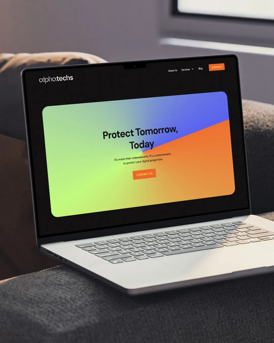
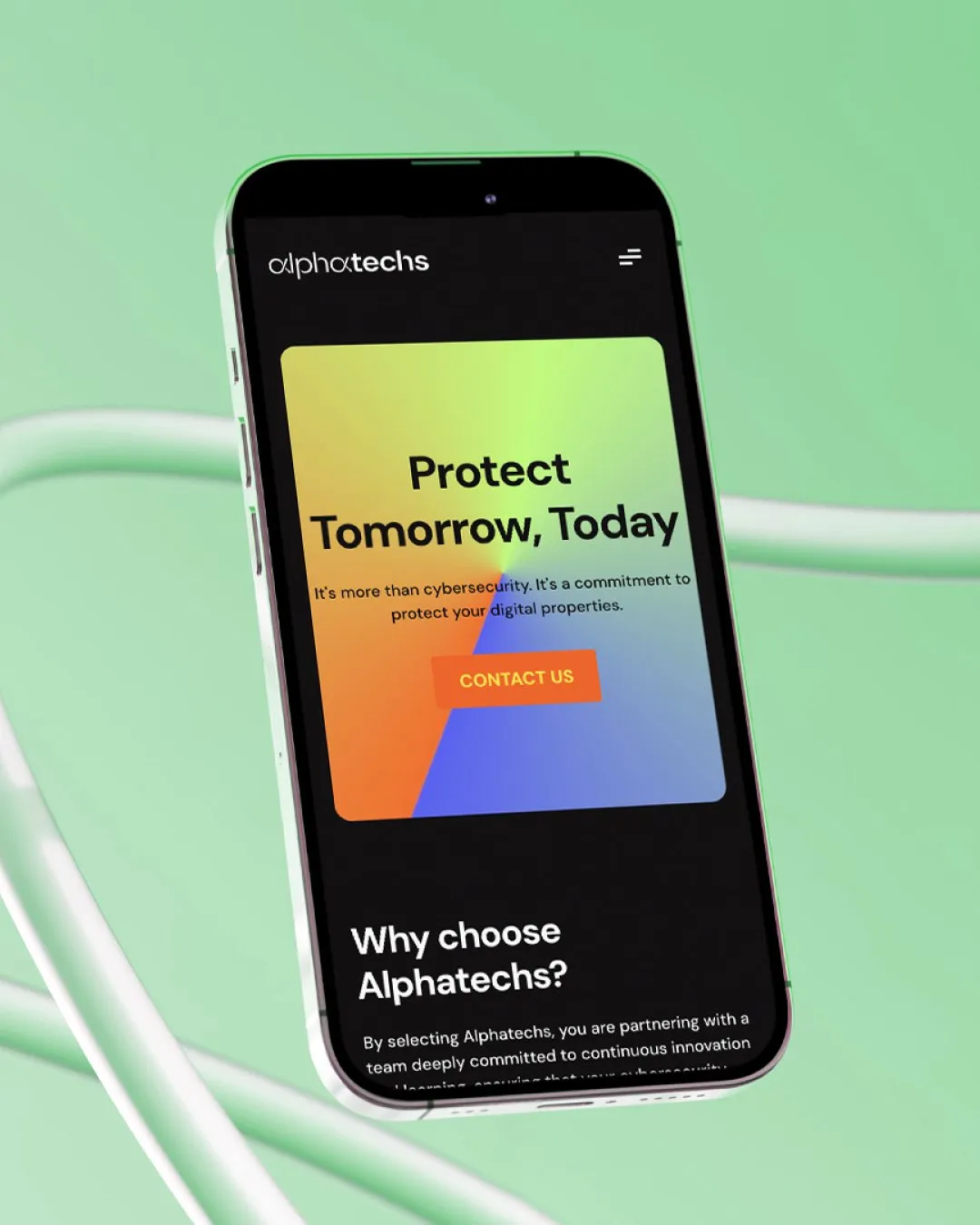
We carried that structure into the website, handling the structure, copy, design, and development. The service colours connected the wider brand with individual pages, giving visitors a visual reference as they explored the offering. The identity and website worked together to make the company easier to recognise and its services easier to understand.

Outcome
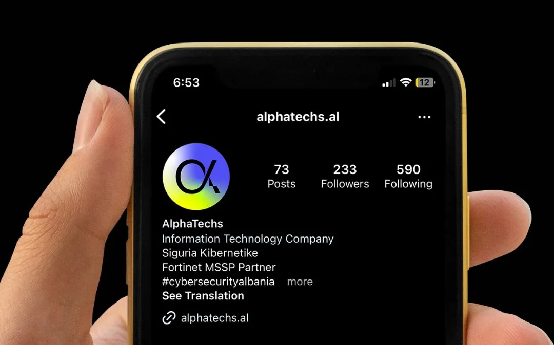
Alphatechs gained a connected brand and website, giving the team a consistent way to present its expertise as it prepared for new markets. The work established a system the company could continue building on as it grew.

Our collaboration influenced the following results

Mateo Gosnishti
Co-Founder @Alphatechs
“STUDIOZ’s approach was not only efficient but also highly creative, resulting in a rebranding that perfectly encapsulates our company’s ethos.”

Read similar case studies

Witway
A friendly identity for a new way to meet online.
Kalemi
Giving the company behind the products a presence of its own.
Sojourn Serai
An identity for a longer kind of journey.